[coveti_shop_v2]
Masterclass Series
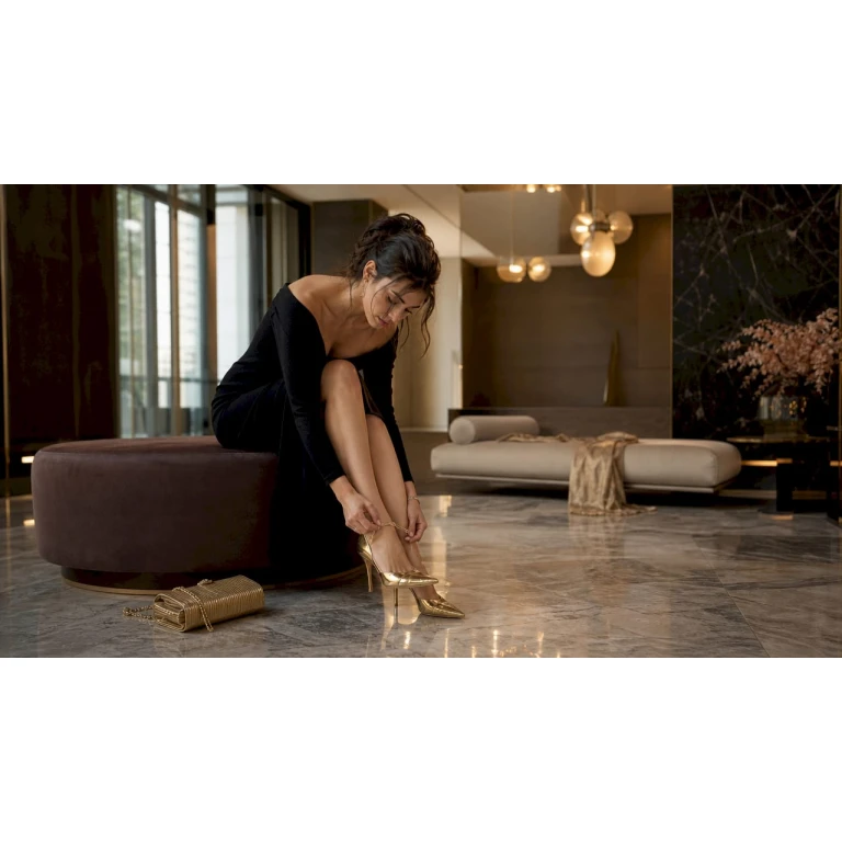
The Art of the Clash: 2026 Styling Guide
Stop playing it safe. Fashion Editor Gemma Deeks reveals the 3 Golden Rules for mixing luxury prints with confidence.
Rule #1: The Unified Palette
Portraiture + Zebra 2.0
The Strategy: This is the foundational clash. When pairing two distinct narratives—like a ‘Face Card’ portrait and a Zebra stripe—the secret is color continuity. Ensure the base tones (e.g., Transformative Teal and Cream) match exactly across both pieces.
“When the colors match, the patterns play. It creates a cohesive editorial story rather than a visual conflict.” — G.D.
Rule #2: Scale Distortion
Hyper-Dot + Bio-Digital Abstract
The Strategy: Visual hierarchy is key. Pair a Maximalist print (oversized Polka Dots) with a Micro print (blurred abstracts). The large print acts as the anchor, while the small print provides the textural depth.
“One print must be the lead actor; the other is the supporting cast. Never let two prints of the same scale compete for the eye.” — G.D.
Rule #3: Anti-Seasonal Pairing
3D Rosettes + Grudge Plaid
The Strategy: Break the rules of seasonal textures. Clash the romantic, tactile nature of a 3D Floral Appliqué with the grit of a colorful, anti-seasonal Tartan. It’s a 1990s ‘Grudge’ revival with a demi-couture finish.
“Clashing textures is as important as clashing patterns. It adds a multi-dimensional feel to your 2026 uniform.” — G.D.
Related Posts

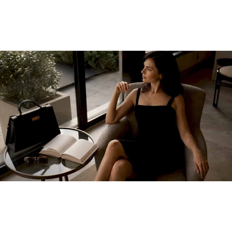
Luxuriöse Accessoires stylen: Tipps für 2026
Entdecke luxuriöse Accessoires Styling Tipps für 2026 und lerne, wie du mit der Drei-Accessoires-Regel jeden Look verfeinerst und überladene Styles...
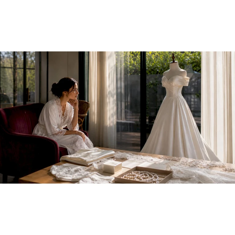
Pași pentru alegerea rochiei de nuntă: ghid 2026
Află pașii pentru alegerea rochiei de nuntă ideale. Ghidul nostru 2026 îți oferă sfaturi utile pentru confort și eleganță în ziua cea mare.

个性化高端鞋定制攻略:从脚型到风格的完整指南
探索个性化高端鞋定制攻略,获取脚型到风格的全面指导,打造属于你的时尚奢华鞋履。
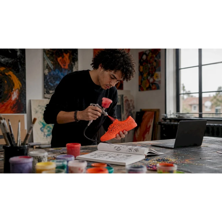
Hoe personaliseer je 3D schoenen: complete gids
Ontdek hoe personaliseer je 3D schoenen in deze complete gids. Maak unieke en duurzame schoenen die echt bij jouw stijl passen!
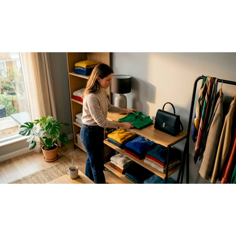
Pasos para crear looks únicos: guía práctica de estilo
Descubre los pasos para crear looks únicos que reflejan tu estilo personal. Organiza tu armario y experimenta con tu ropa para brillar.

The Best Gifts for Men in 2026: Independent Designer Picks
Why Independent Designer Gifts Land Differently
The Gift Categories Worth Exploring in 2026
Statement Outerwear
Bags and Accessories
Sh...
The Best Ganni Dresses to Buy
The Luxury Handbags edit of the best Ganni dresses, from printed and smock shapes to satin party pieces.
The Best Ganni Jeans: Stary, Audri and Every Cut
A guide to Ganni jeans cut by cut, from the Stary and Audri to the Betzy and baggy fits, with sizing help.
Ganni Sizing Guide: Does Ganni Run True to Size?
The full Ganni sizing guide, with a UK conversion chart, fit notes, and how the denim is sized.
Is Ganni Worth It? An Honest Buyer’s Guide
Is Ganni worth the money? An honest look at the quality, the price, and who the Copenhagen label actually suits.
Ce înseamnă timeless elegance: ghid complet 2026
Află ce înseamnă timeless elegance și cum poți construi o garderobă atemporală. Descoperă secretele unui stil vestimentar care nu se demodează!
Rol van schoenen bij galafeest: stijl en comfort
Ontdek de rol van schoenen bij galafeest. Maak een stijlvol en comfortabel statement met de juiste keuze voor elke gelegenheid.